Everything All the Time — Band of Horses
A conceptual reinterpretation of Band of Horses’ Everything All the Time, translated into a restrained, system-driven vinyl format that explores repetition, saturation, and emotional persistence through typography, materiality, and physical pacing.
The project was built around a single conceptual constraint: how to visually represent the feeling of “everything, all the time” without relying on loud color, illustrative imagery, or expressive typography. All visual decisions were limited to subtle typographic variation, repetition, opacity, and physical format. No illustrative elements or decorative gestures were introduced. The system was required to remain quiet, restrained, and legible under pressure.
Client
PERSONAL PROJECT — CONCEPTUAL REINTERPRETATION
DELIVERABLES
VINYL ALBUM ARTWORK DOUBLE-PAGE INSERT INNER SLEEVE TYPOGRAPHY RECORD LABEL DESIGN PHYSICAL MOCKUPS
Year
Role
ART DIRECTION · TYPOGRAPHIC SYSTEMS · PHYSICAL MEDIA DESIGN
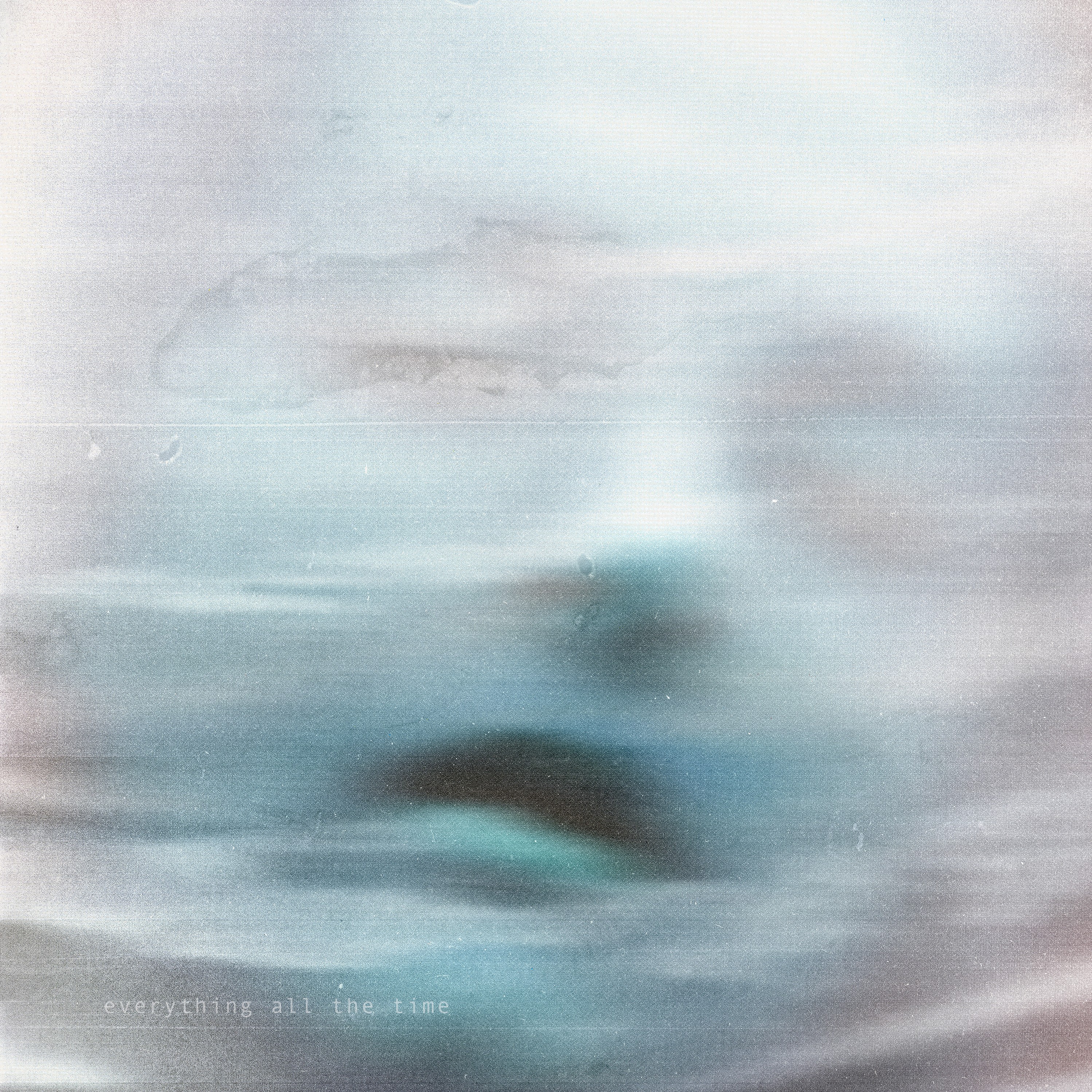
The cover establishes the emotional and conceptual tone of the project. Rather than illustrating a specific moment, it presents a state of continuous motion, softened memory, and cognitive saturation. The absence of a clear focal point mirrors the album’s themes and informed the restrained typographic system used throughout the physical release.

This project was approached as a complete, closed system rather than a collection of individual artifacts. Every surface, including the cover, inner sleeve, labels, and typography, operates under the same logic of restraint, repetition, and controlled imperfection. The palette remains muted to allow texture, motion blur, and negative space to carry emotional weight without relying on overt imagery. Typography functions as structure rather than decoration, creating cohesion across formats.
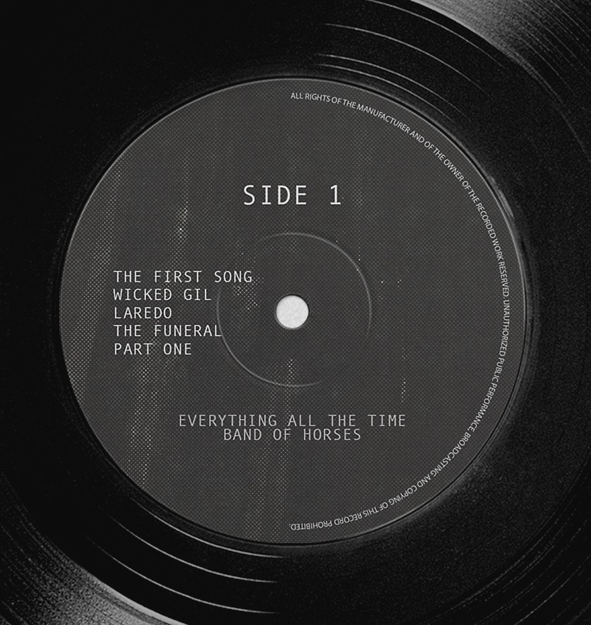
The record label became the most disciplined expression of the system. Typography was treated as embedded material rather than overlay. Spacing, weight, and alignment were reduced to their functional minimum, allowing grain, wear, and repetition to carry meaning. The label was designed to feel archival rather than graphic, reinforcing the idea that nothing demands attention, yet everything remains present.

The inner jacket was designed as a typographic field rather than a layout. By repeating the album title at low contrast and varying density, the spread relies on rhythm and accumulation instead of hierarchy. This mirrors the album’s pacing and reinforces duration over moments. As the final element in the system, it allows the visual identity to dissolve gradually through restraint, texture, and repetition rather than conclude abruptly.